Webflow

Selected projects 2015-2021.

Webflow is a "no-code" web platform.

I joined the team as one of the first two designers in 2015. Over the next six years, I have contributed to the development of numerous new features and enhancements for the Webflow Designer. My work has included designing layout systems and creating animation and interaction tooling, among other tasks.

This portfolio showcases some of the projects I have worked on during these years. Note that some of my most recent and impactful work is still unreleased and cannot be shown at this time.

Webflow Designer

#Grid layout with direct manipulation

CSS Grid is a powerful new layout mechanism that has transformed the way web developers create layouts. The challenge was to make it easier to use in Webflow by abstracting some of the complexity and allowing users to create grid layouts visually, using direct on-canvas manipulation.

Unlike previous tools in Webflow, which required most style properties to be adjusted via the inspector panel, we wanted the Grid to be different. Given the visual nature of CSS Grid, we felt that Webflow was the ideal platform for creating grid layouts in a fully visual way, using direct on-canvas manipulation.

Working with grid layout in Webflow

Working with the team, I explored various ways to interact with a grid on the canvas. After months of iteration and testing, we developed a powerful and simple solution that fully leverages Webflow's visual nature for creating grid layouts.

Overview of grid's main features
Grid playground built in Webflow for feature release

Shortly after the initial release, we added support for working with Grid template areas, which made it even easier to create and adjust grid layouts using direct on-canvas manipulation.

Defining grid areas on canvas
Adjusting areas for smaller screens

#Components and instance overrides

In the past, Webflow had a feature called "Symbols" which allowed users to reuse an element across multiple pages. For example, a user could create a Symbol for a navigation bar, footer, or sign-up form and reuse it on multiple pages. However, there was no way to use the same Symbol with different content. This limitation greatly reduced the range of situations in which Symbols could be used.

To address this limitation, I worked on evolving Symbols into Components by adding the ability to override content parameters. This allowed authors to define text, images, links, and other properties that could be edited on individual Component instances.

This update significantly expanded the range of situations in which Components could be used. Authors could turn various recurring layouts into Components and reuse them across their project, applying individual content overrides as needed. Any structural or stylistic changes made to the Components would be reflected in all instances, while the content overrides would be retained.

Defining overrides on a component
Overriding content on instances
Adjusting layout across multiple instances

#Interactions and animations

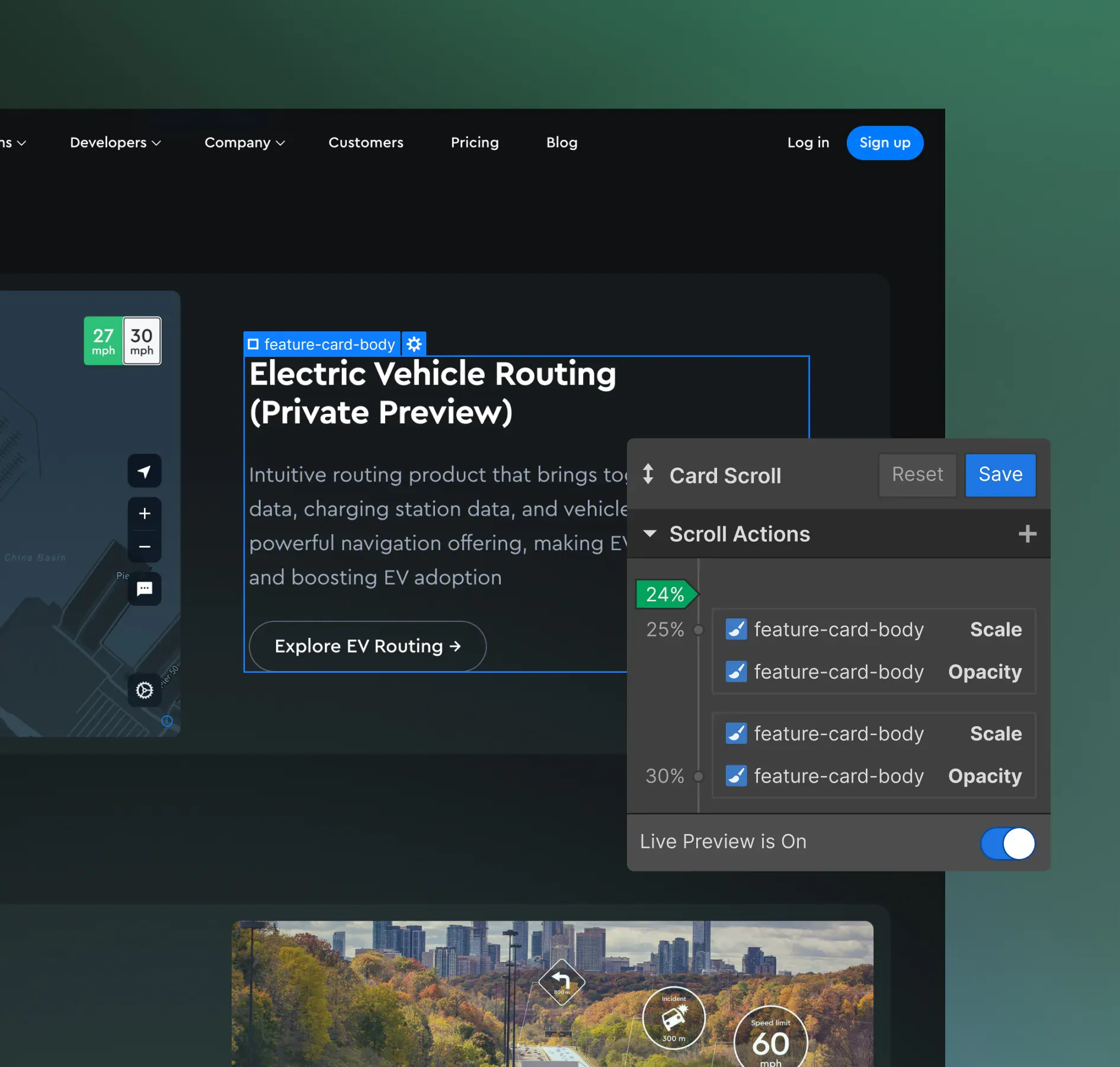
When I started working on "Interactions 2.0", Webflow already had basic tools for adding interactions and animations to elements on a page. However, we wanted a more powerful and flexible solution that would allow authors to create rich, sequenced animations using a visual timeline. Additionally, we wanted to give authors the ability to create animations and interactions based on various dynamic inputs, such as scroll position or mouse movement.

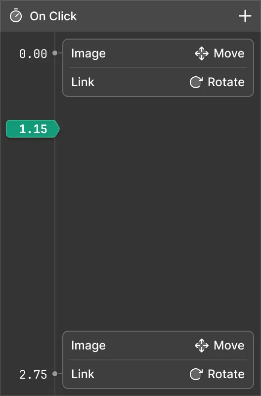
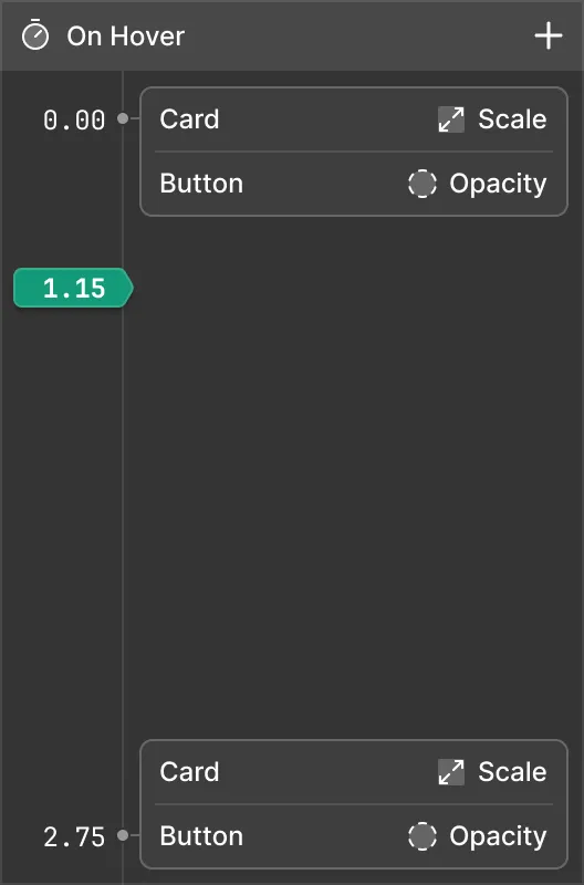
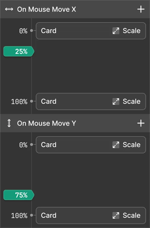
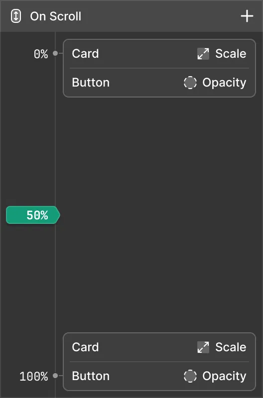
While exploring different approaches for a visual interface, I came up with the idea of a simplified vertical timeline that would allow authors to stack various "actions" along an axis. The vertical axis can represent either time or a dynamic value from user input, such as mouse position or scroll progress.

This interface metaphor proved to be a good balance between the full-blown timelines found in professional animation software and a simple yet flexible way to create rich animations and interactions.

Examples of timed and dynamic animations triggered by various events
Overview of creating various animations
Adjusting the easing curve on an intro animation
In the wild: various animations and interactions created using this feature in Webflow

#Flexbox

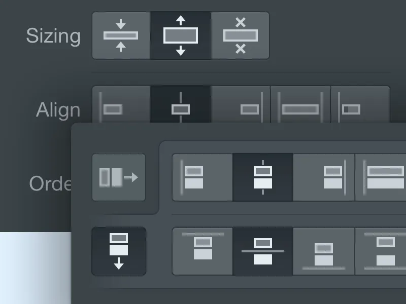
This was one of my first projects after joining the team. The challenge was to translate a powerful CSS layout mechanism into a simple and intuitive visual interface that allowed designers to create expressive, responsive layouts on the web.

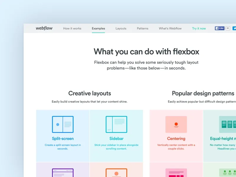
This feature was released in the early days of Webflow, when the design team was just two people. In addition to my product design work, I also built a Flexbox learning game in Webflow and an educational marketing website for feature release.

Flexbox has proven to be a very useful addition to Webflow Designer. Since its initial release in 2016, I have worked on several updates that improve and streamline the interface.

Flexbox in action
UI mockup for flexbox controls and the marketing site